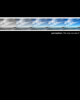
potential yearbook cover

fade to color
Originally uploaded by hijohnmark.
Eh? Eh? It's a work in progress, and this is merely a concept, but it's the general theme wer'e going for. We'll probably end up using a different photo, but I'd really like the dominant color to be blue. It's a bold, refreshing color that I really like. We're going for a classy, clean, simple look this year. Our set theme is "perception: the way we see it." Comments? Questions?
Other concepts can be found here.


1 Comments:
I like the idea but it could use some work. Like I told you before, a whole panorama would look better. I think the text also needs work. Here's a sample using a single panorama (not that I'm suggesting you use this one). http://i3.tinypic.com/2wrnllx.jpg
Post a Comment
<< Home